A recent visit to the Science and Industry Museum in Manchester provided an opportunity of enjoying the museum’s collection of trains. Is it a bit trainspottery to experience a frisson of nostalgic excitement when looking at old railway engines? The magnificent engineering is impressive, but nuts and bolts are less riveting to a graphic designer than shiny liveries and hand-painted type.

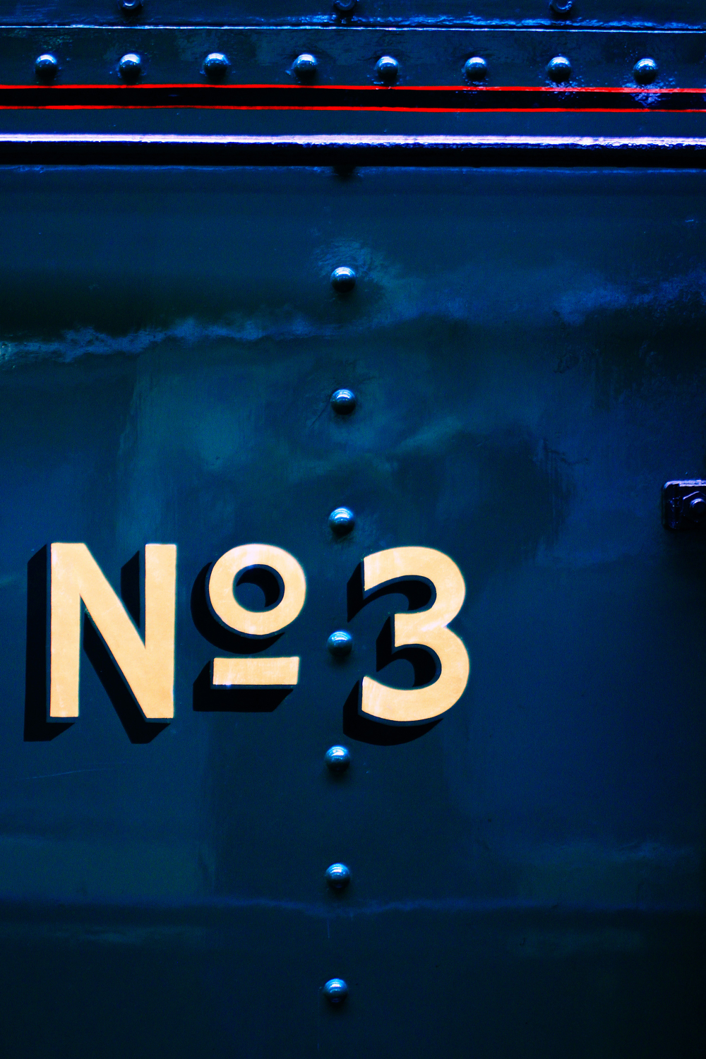
The serial numbers, stripes and flourishes painstakingly painted on gleaming locomotives and glossy carriage doors give a glimpse of a more romantic era when craft and aesthetics meant more than branding or corporate identity. The human touch is evident: but the almost imperceptible fluctuations and very marginal inaccuracies of hand-painted lettering add to, rather than detract from, its charm. They humanise it.

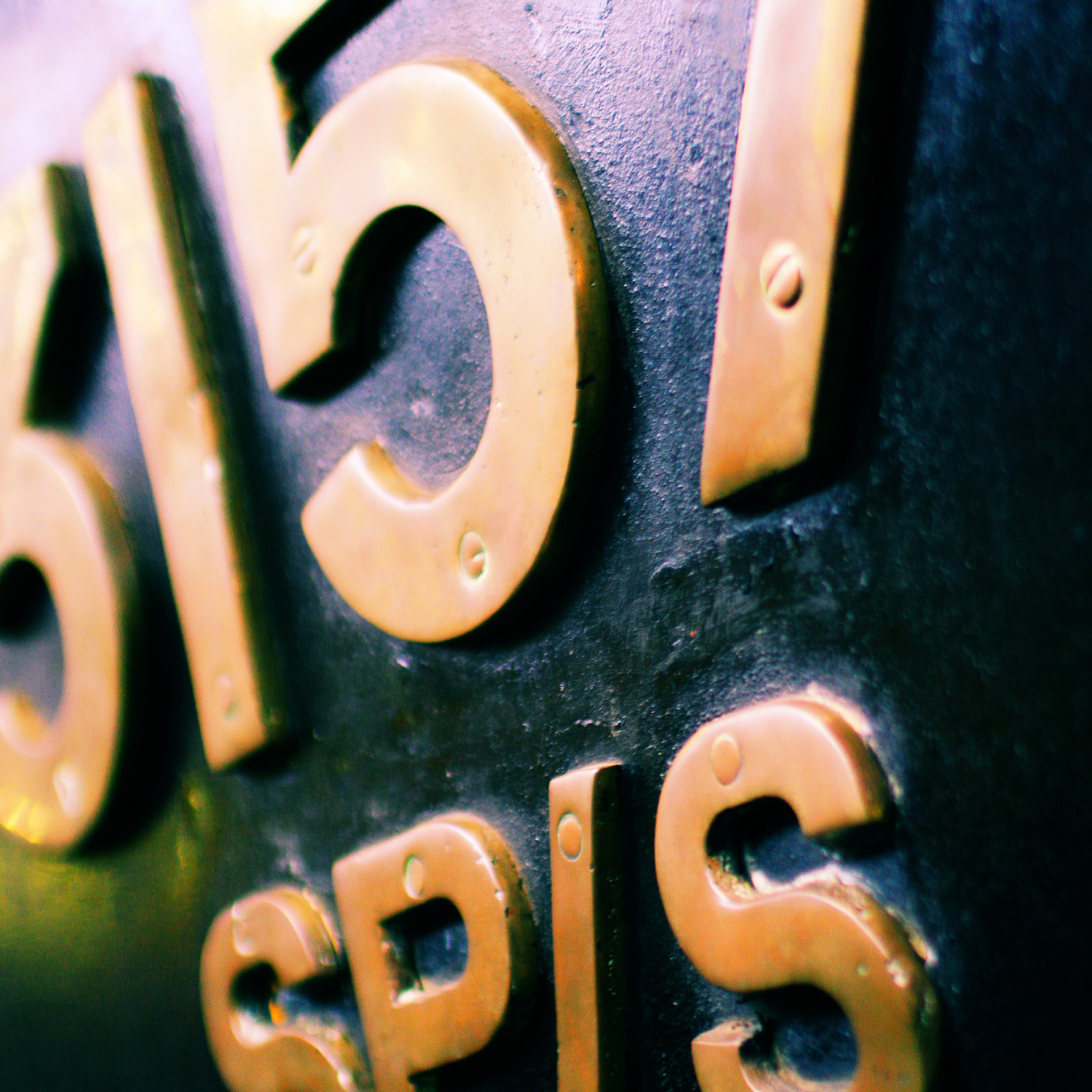
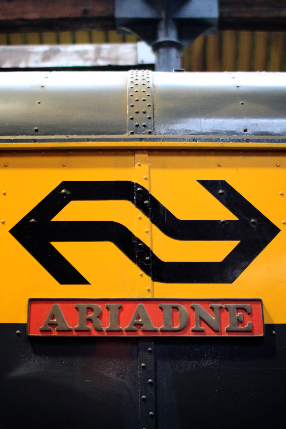
The brass lettering that superseded painting has a quality that successfully juxtaposes industry and art. The letters are made by a heavy industrial process yet they have a refined finish. A high polish gives them jewel-like quality but they’re chunky and fit for heavy duty. Perhaps that’s why the idea of a massive, diesel-smeared railway engine bearing the name of a graceful Goddess from Greek mythology doesn’t seem incongruous.
The more recent locomotives on display in the museum sport less fancy uniforms. Handsome has started to play second fiddle to function. That said, most designers love a bit of Swiss, so the classic typographical simplicity of black Helvetica bold on a buttercup background is a visual treat. Given its easy legibility from afar, it’s probably safe to say that this was also a favourite style of the notebook-wielding number collectors who haunted, and still haunt, the far reaches of Clapham Junction railway station.

Passenger trains today are clad in ubiquitous vinyl – multi-hued waves, go faster stripes or, even more offensive, advertising wraps that encase the entire train from top to toe. Visual relief from such blandness is provided by a therapeutic immersion in the golden years of railway typography by a trip to the Science and Industry Museum in Manchester.
It’s quicker by train... or it used to be.

