YO! Kitchen
YO! Kitchen is the latest venture from the brand that pioneered Japanese dining in the UK.
We won a creative pitch to design and write copy for the menus for the new concept – a more sophisticated version of YO! Sushi where the help yourself conveyor belt is replaced by full table service. The principle is to select and share a variety of dishes to experience the full spectrum of real Japanese food.
copywriting / illustration / print / food and drink

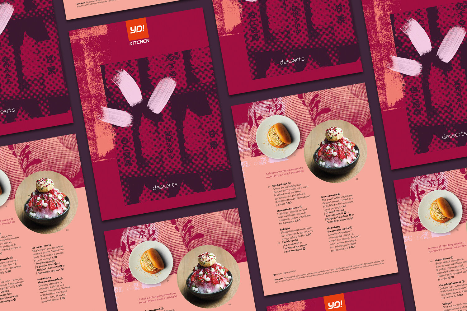
We designed the cover of the menus in a style consistent with the interior decor of the restaurant which aims to convey diners to modern, urban Tokyo with hints of traditional Japanese culture too.
For extra prestige the 12 page main menu is presented to customers bound by a bright red band to a light wooden board. The menu content is arranged in clearly defined sections with crisp typography in typically orderly Japanese-style layouts punctuated by dish images, subtle graphics and cultural references. Backgrounds are muted to highlight the vivid colours of the food depicted.


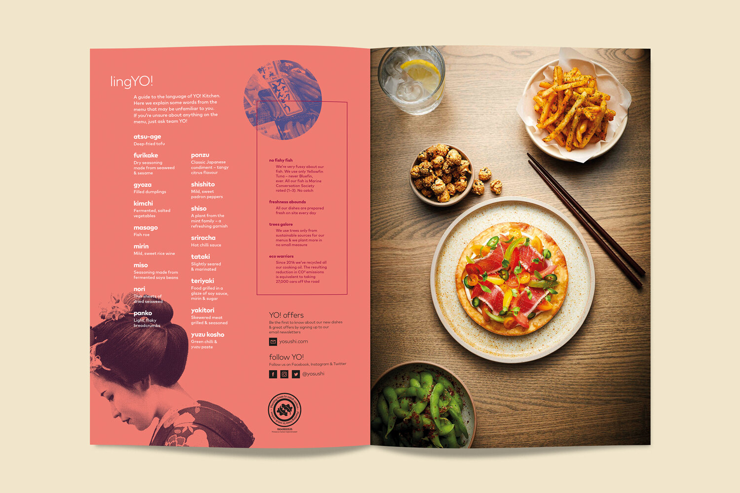
For customers new to Japanese food we included a ‘LingYO!’ glossary defining the less common Japanese dishes and ingredients. This shares a page with bites of information about provenance and sustainability.
The desserts, take-away and kids menus follow the same graphic style to create a consistent set.