ORB Properties
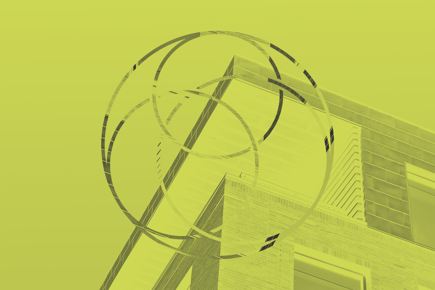
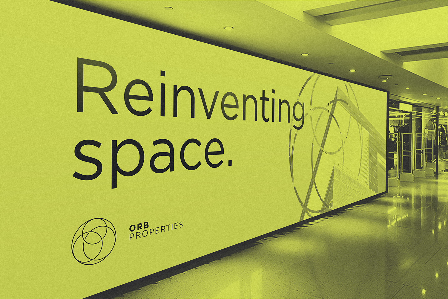
The name ORB was created from the first initial of each of the business founders. The spherical implication of the acronym gave us some obvious cues to the design of the company’s visual identity. In the logo, the interlocking circles – three of them within one complete orbit – again represent the partners, and suggest the harmonious interaction of their different roles in the business.
The fine lines of the symbol and the precise simplicity of the namestyle give the identity a relevant architectural quality.
identity / COPYWRITING / PRINT / RETAIL