ManíLife Peanut Butter
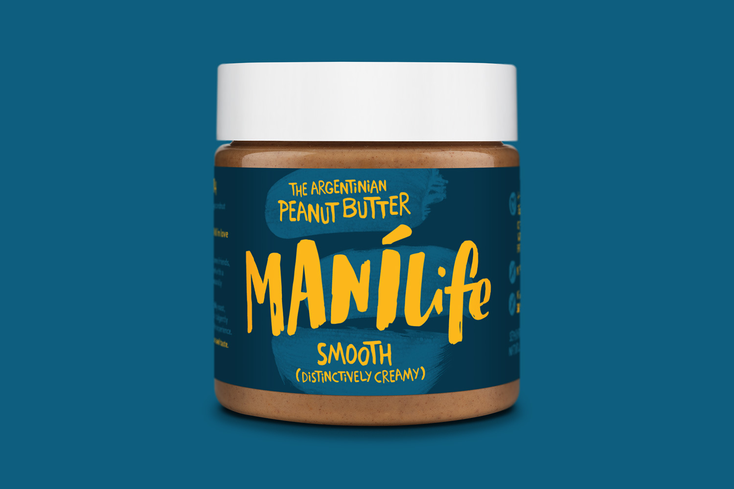
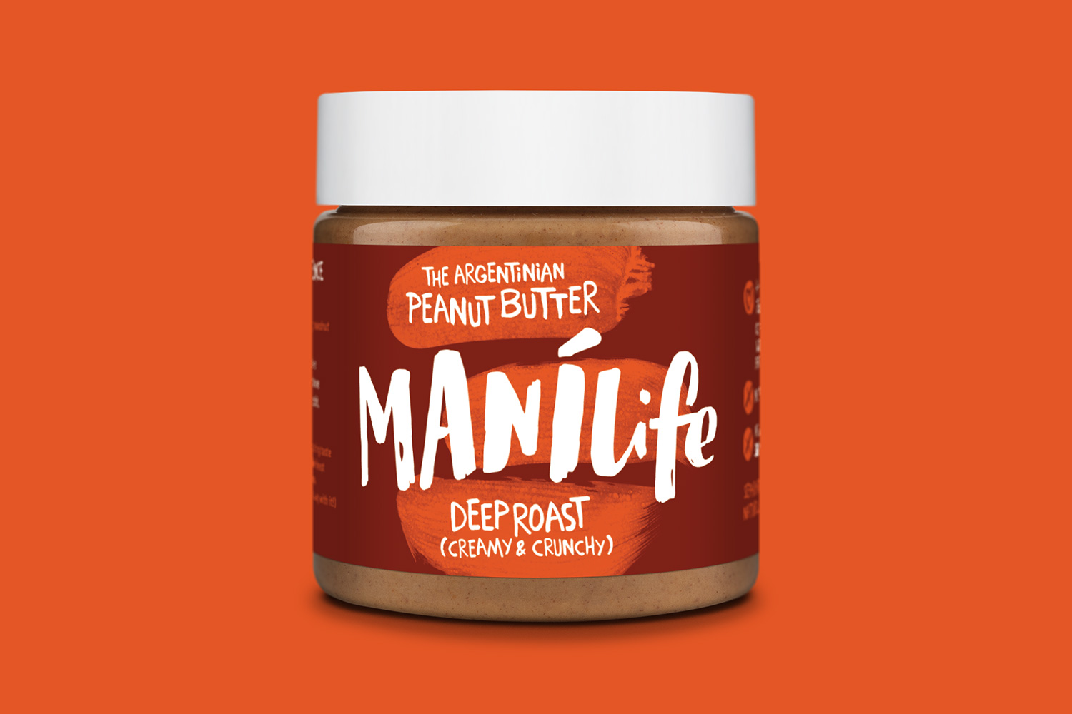
We were commissioned by the founder of growing peanut butter business ManíLife to design a new identity and packaging. The product is made in London using peanuts imported only from Cordoba and our brief was for this unique Argentinian provenance to be apparent in the label designs. The owner’s passion and sense of fun were also to be evident – and the packaging had to be strikingly different from every other peanut butter brand out there.
IDENTITY / illustration / PACKAGING / food and drink / RETAIL


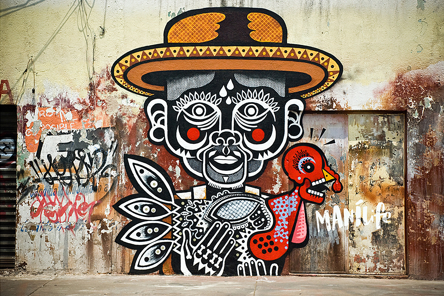
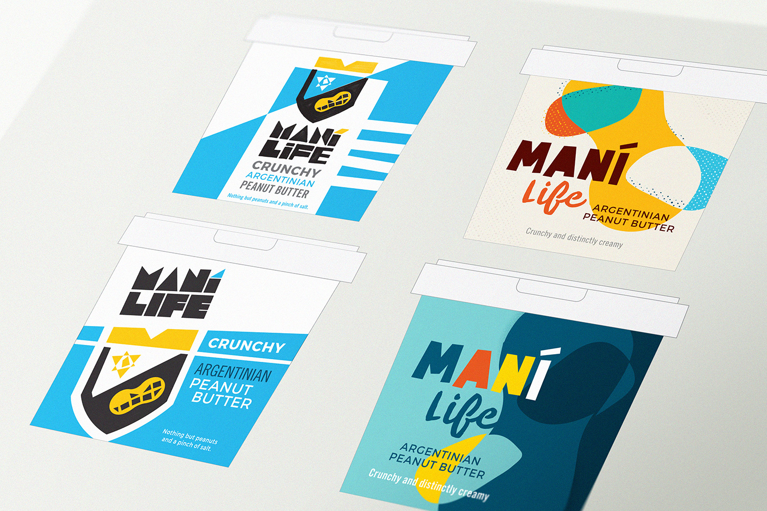
We initially aimed to capture the essence of Argentina’s contemporary culture with bold, badge-like marks that would appeal to ManíLife’s loyal and growing tribe of peanut butter fans. In retrospect, these were overtly Argentinian with too much emphasis on Porteño machismo. We reigned in the swagger to create a variety of designs referencing the diversity of Argentinian street art – in particular the work of Cordoban muralist Elian whose colourful organic shapes suited such a natural product.
ManíLife peanut butter really is pure and natural – only peanuts blitzed with a pinch of sea salt – so we further simplified the hand-crafted style into a design enlivened with chunky brush strokes and a sprightly hand-drawn namestyle. These elements were applied in distinct colour ways to the packaging for the three products in the initial range. The design has the versatility to be rolled out in an infinite number of colour permutations as the product range grows.